(designer)
Sergey Bakiev —
Hi. My name is Sergey, and I'm a web designer working on turnkey projects. I create websites that don't just look pretty, but solve business problems: attract customers, build trust, and strengthen branding. I work with structure, logic, visuals, and meaning—from the initial idea to the finished product. For me, design isn't just decoration. It's a tool for growth.
[ experience ]
2022——2026
Over the past four years, I've completed dozens of projects—from landing pages to multi-page websites and comprehensive redesigns. I work full-cycle: analysis, structure, prototyping, visual concept, assembly, and launch. I understand how to combine aesthetics and usability to create a website that's modern, intuitive, and effective. It's important to me that the design doesn't become outdated within six months—that's why I emphasize system, logic, and the quality of details.

50+
completed projects
95%
customer return
4+
years in design
100%
I bring projects to launch
[ cases ]
50+
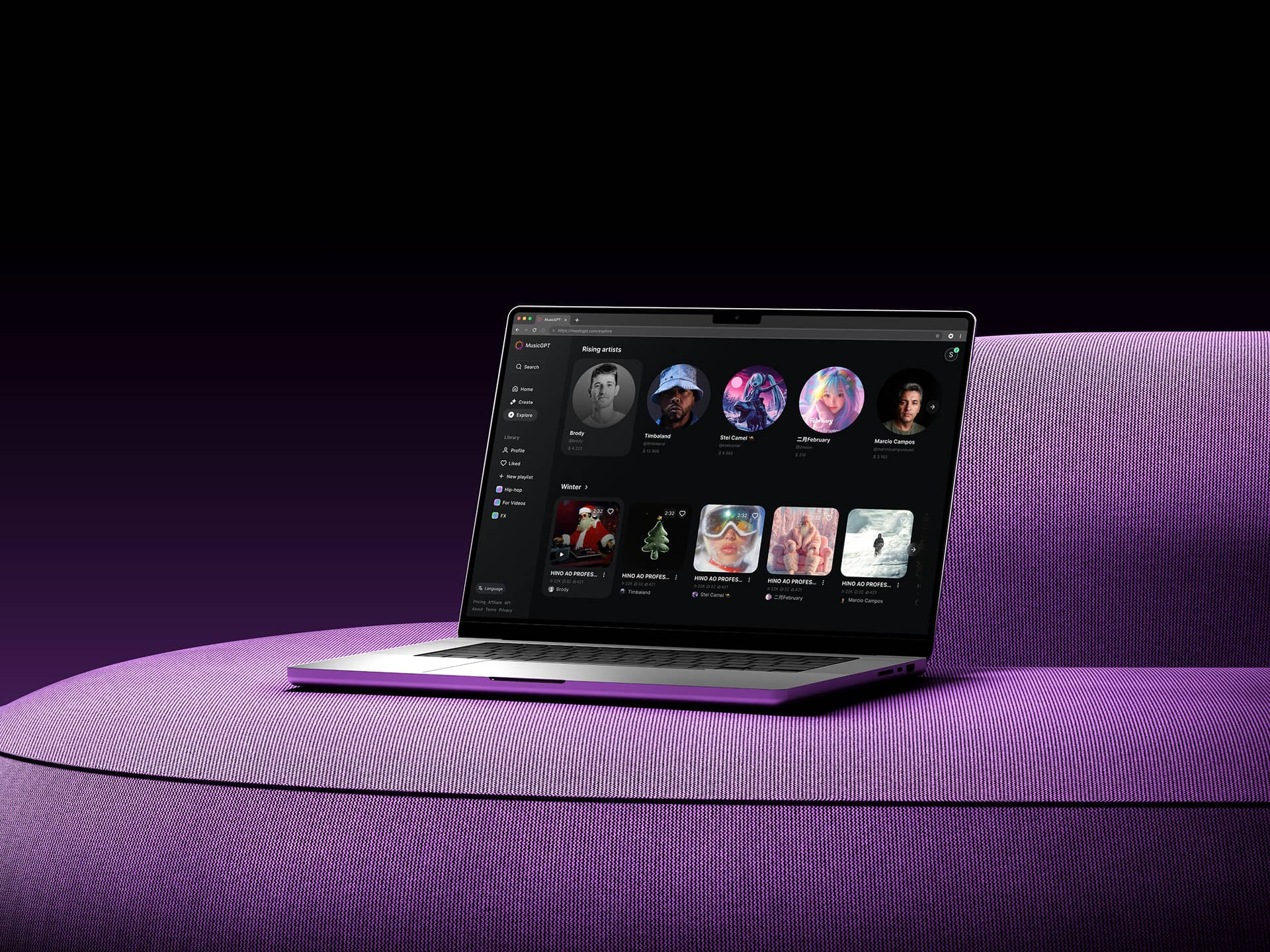
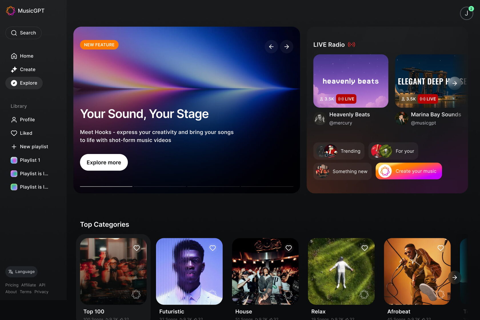
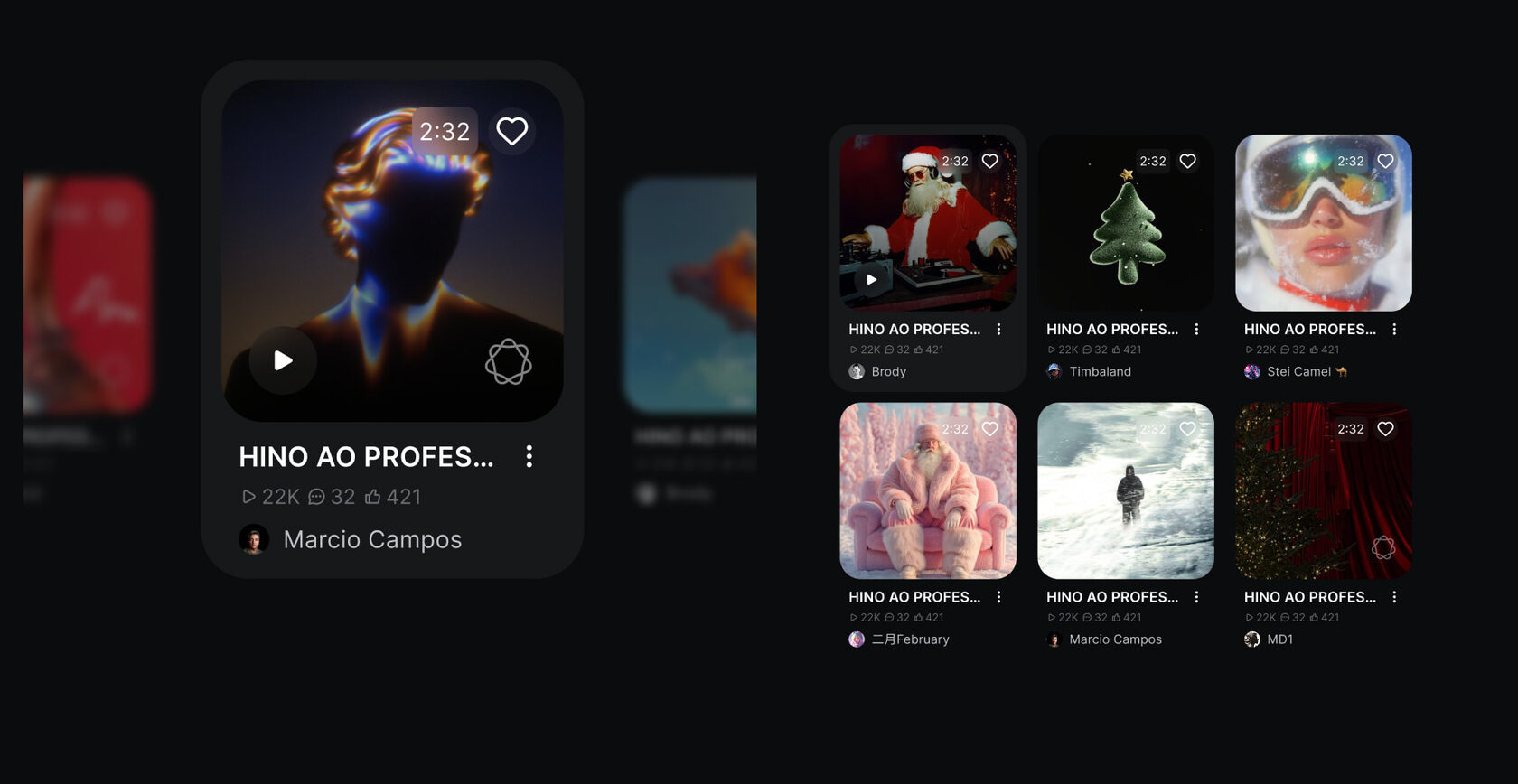
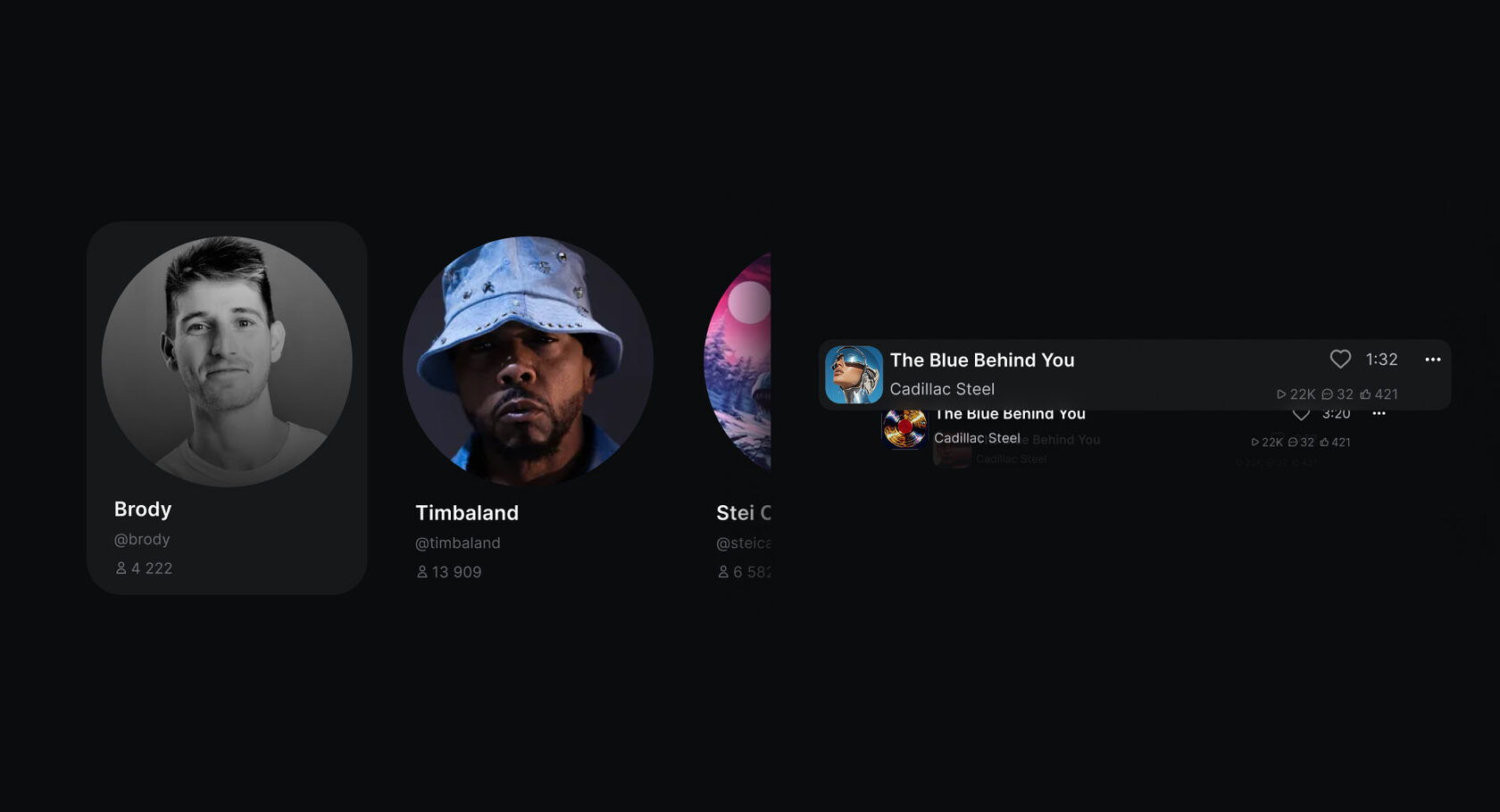
The task was to redesign the Explore page and make it logical, understandable, and closer to the product's real goals. At launch, the page looked overloaded: blocks didn't reinforce each other, semantic accents were missing, and the user flow was fragmented.
I conducted a detailed structural audit and identified weak points: broken elements, logical breaks, visual overload, and a lack of a clear content hierarchy.
I then rebuilt the page from scratch: I built a new structure, redesigned each section, and added functional elements that enhance the service's value. I focused primarily on a clear user path and familiar interaction logic, similar to music platforms.
The result is an interface that is easier to perceive, quickly orients the user, and emphasizes the key features of the AI service. The updated mockups were prepared for submission to development.
2026
↳ musicgpt.com
close ↵
client
Music GPT AI music service
task
Explore page redesign
volume of work
audit, UI/UX design
development time
1 week
tools
Figma
The Explore page has been redesigned to be more structured and user-friendly. The focus has been on navigation, visual hierarchy, and ease of interaction.
The design relies on a clean grid, neat typography, and clear accents, allowing users to quickly navigate the content and focus on the service’s key features.
The interface is modern, technologically advanced, and logically closer to familiar music platforms, lowering the barrier to entry and making the service intuitive to use.
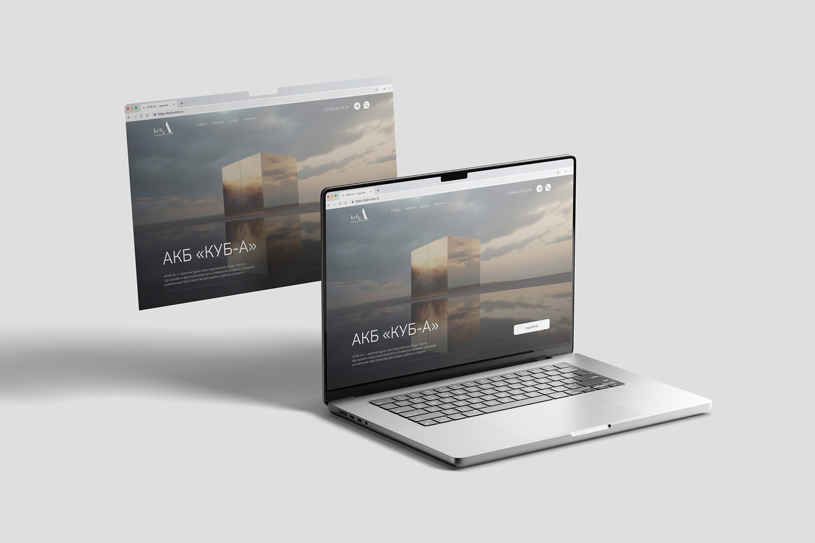
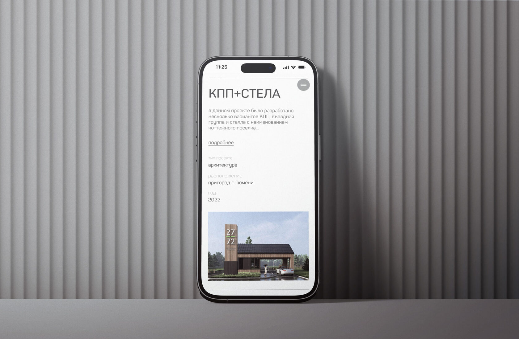
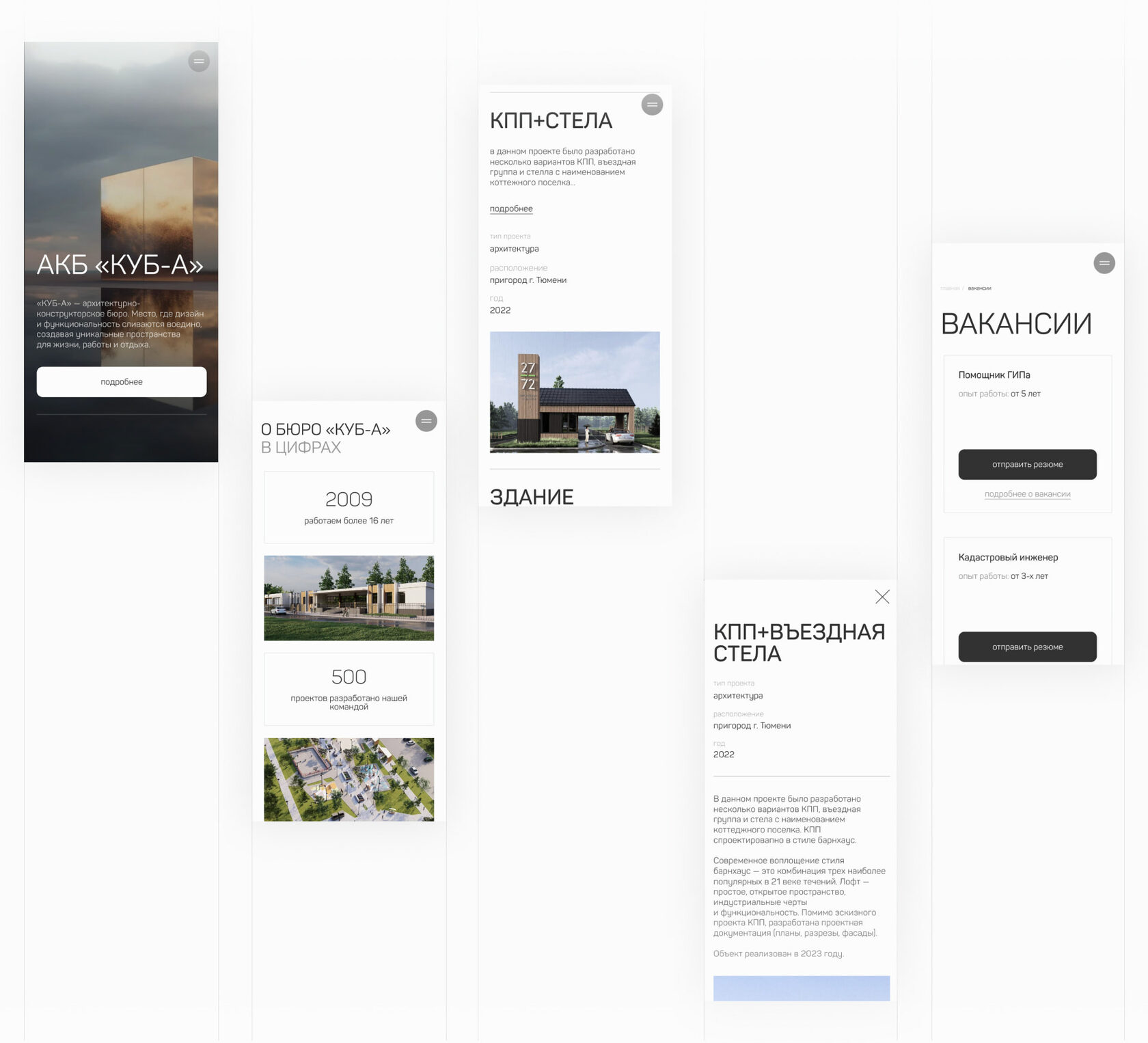
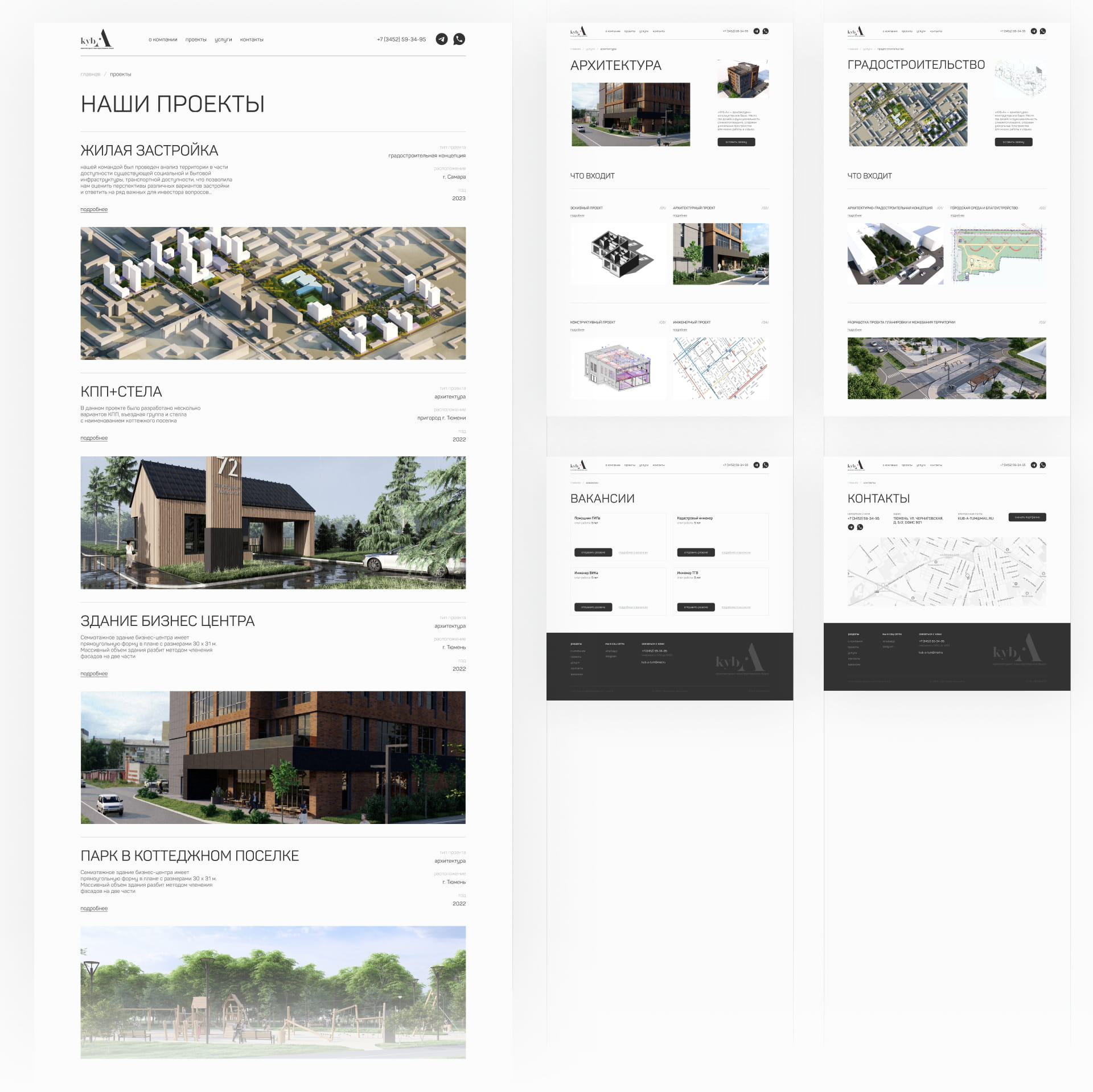
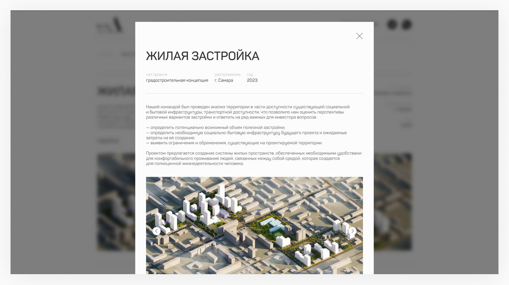
The task was to create a modern website for the architectural firm "Kub-A" that would highlight aesthetics, professionalism, and attention to detail. It was important to emphasize the portfolio and visual clarity without overloading the interface with unnecessary elements.
At the start, the website didn’t convey the depth of the projects or the firm’s character. The structure required a redesign, and the visual language needed to be more systematic and hierarchical.
I redesigned the entire logic of the multi-page website: I created a clear user journey and thought through the flow of presentation—from drawings and concepts to photographs of completed projects. I paid special attention to typography, grids, and the balance of space in the layouts.
The website was entirely designed and built on Tilda, maintaining a neat visual dynamic and a focus on the projects.
2025
↳ kub-a-tmn.ru
close ↵
client
architectural bureau "Kub-A"
task
multi-page website redesign
volume of work
Structure, UX logic, UI design, assembly on Tilda
development time
3 weeks
tools
Figma, Tilda, Midjourney
The result is a minimalist and polished website that showcases Kub-A's projects as a harmony of architecture, design, and functionality.
The interface is built on a clean grid, neat typography, and a well-thought-out visual hierarchy. The primary focus is on the portfolio—the projects are perceived as cohesive and consistent, without distracting elements.
The website has become a presentation tool that matches the firm’s level: calm, modern, and professional in nature, with a focus on the quality of architectural solutions.
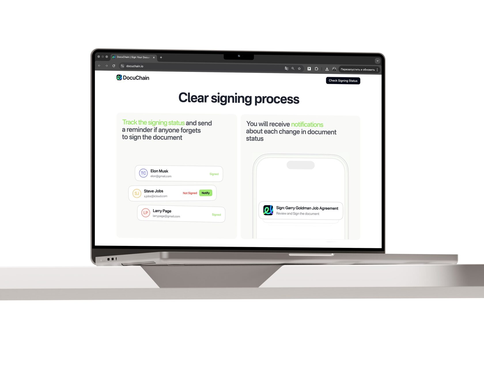
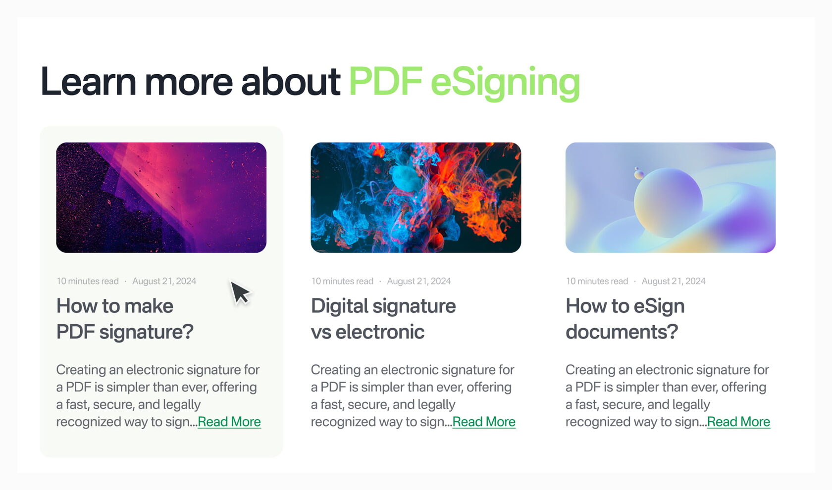
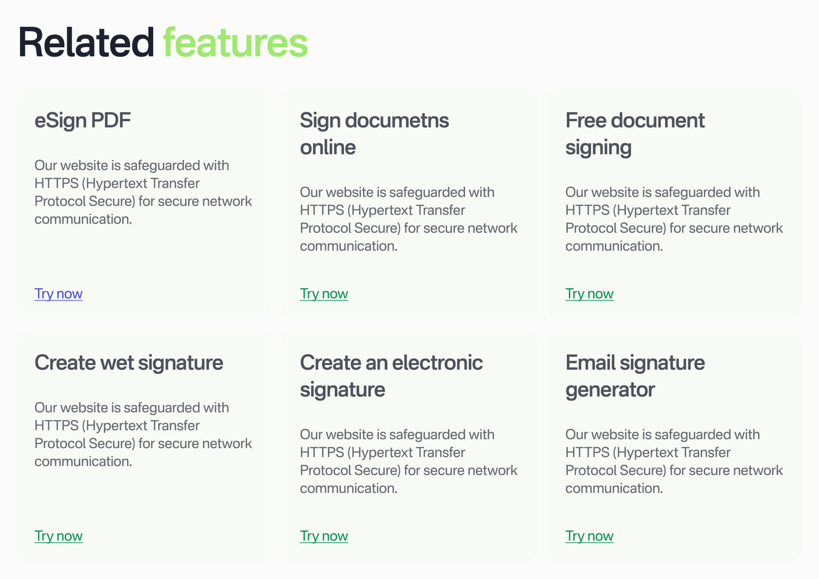
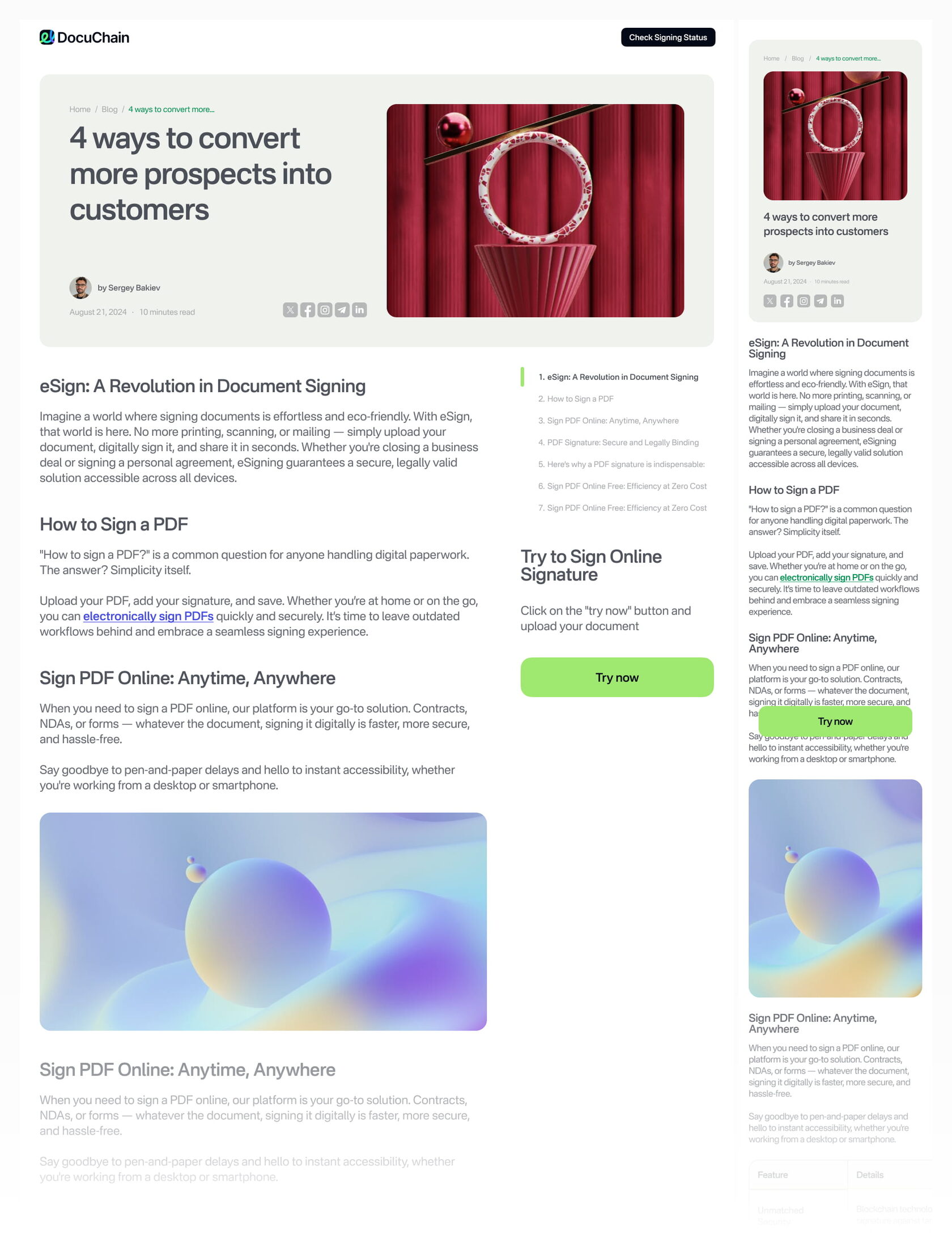
The goal was to improve the DocuChain website structure with universal, reusable blocks and a more functional blog section.
I developed a system of reusable UI blocks, established a clear visual hierarchy, and designed a fully functional blog with an SEO-friendly structure. I prepared responsive layouts and handed them over to the developers for implementation on Webflow.
I developed a system of reusable UI blocks, established a clear visual hierarchy, and designed a fully functional blog with an SEO-friendly structure. I prepared responsive layouts and handed them over to the developers for implementation on Webflow.
2025
↳ docuchain.io
close ↵
client
DocuChain
task
launching an SEO blog
volume of work
UX logic, UI design
development time
5 days
инструменты
Figma
A flexible and scalable interface system was created, simplifying the addition of new content and speeding up the team’s work.
The launch of a structured blog improved the site’s SEO, increased organic traffic, and attracted new users through search queries.
The interface became more consistent, intuitive, and stable across all devices.
The launch of a structured blog improved the site’s SEO, increased organic traffic, and attracted new users through search queries.
The interface became more consistent, intuitive, and stable across all devices.
[ gallery of works ]


[ services ]
sbvision.ru
I work systematically and transparently: under a contract, with staged payments and clear deadlines. Each project goes through a full cycle—from analysis and prototyping to final launch.
For me, it’s not just about "designing" a project; it’s about creating a working tool that strengthens its positioning and helps businesses grow. That’s why I delve deeply into the task and offer solutions, not just visuals.
I feel comfortable working with brands and people who value quality, are open to change, and understand that strong design is an investment, not an expense.
Landing pages and turnkey websites
(from $450)
(from $450)
I develop websites that solve specific business problems—from the first touchpoint to the final application.
I immerse myself in the product, assemble the structure, think through the user journey, and only then move on to the visuals. I create responsive design, prepare for launch, and deliver a working tool, not just a mockup.
I immerse myself in the product, assemble the structure, think through the user journey, and only then move on to the visuals. I create responsive design, prepare for launch, and deliver a working tool, not just a mockup.
Redesign of existing projects
(from $200)
(from $200)
If a website already exists but isn’t fully functional, I conduct an audit and rebuild its logic.
I identify weaknesses in the structure and presentation, strengthen the visual system, and simplify the user experience. For me, a redesign is a way to take a project to the next level while preserving its strengths.
I identify weaknesses in the structure and presentation, strengthen the visual system, and simplify the user experience. For me, a redesign is a way to take a project to the next level while preserving its strengths.
SMM Design and Digital Creatives
(from $10)
(from $10)
I create visuals for social media: posts, stories, advertising layouts, and templates.
I help create a cohesive style that stands out in the feed and enhances brand perception. When needed, I use AI tools to generate graphics and photos—this allows me to quickly test ideas and create unique content without lengthy production processes.
I help create a cohesive style that stands out in the feed and enhances brand perception. When needed, I use AI tools to generate graphics and photos—this allows me to quickly test ideas and create unique content without lengthy production processes.
Design for printing
(from $30)
(from $30)
Business cards, brochures, catalogs, presentations, packaging—I design layouts that meet technical printing requirements.
I maintain a consistent brand style so it looks professional not only digitally but also offline.
I maintain a consistent brand style so it looks professional not only digitally but also offline.
[ contacts ]
8:00——20:00 (MSK)
gmail